Introduction
Digital design has changed dramatically over the past decade. Screens are no longer limited to standard desktop monitors. Today, users browse content on smartphones, tablets, ultrawide displays, foldable devices, and even smart TVs. In such a dynamic environment, rigid design systems struggle to survive. This is where pxless design becomes highly relevant.
Pxless is not just a technical adjustment; it is a modern design philosophy. Instead of depending heavily on fixed pixel values, pxless focuses on flexible, relative measurements that adapt to different screen sizes and user preferences. This approach allows layouts, typography, and spacing to scale naturally without breaking or appearing inconsistent.
In this comprehensive guide, you will learn what pxless really means, why it matters in modern digital environments, how it works across different platforms, and how you can implement it effectively. By the end, you will understand why moving toward a pxless system can transform the way you design and build digital experiences.
Will You Check This Article:ARK Augmented Reality: Building Digital Layers for Real Life
What Is Pxless Design and Why Is It Important?
Pxless design refers to creating layouts and user interfaces without relying primarily on fixed pixel units. Traditionally, designers and developers used pixel values to define widths, heights, margins, and font sizes. While this method worked in the early days of web and application development, it now creates limitations in a world filled with diverse screen dimensions and resolutions.
Pixels are absolute measurements, which means they do not automatically adjust to user preferences or device changes. When screens vary significantly in size and density, pixel-based layouts may appear too small, too large, or misaligned. Pxless design solves this issue by emphasizing proportional relationships instead of rigid dimensions.
The importance of pxless lies in its adaptability. It allows content to respond smoothly to environmental changes. It respects user accessibility settings. It reduces the need for constant redesigns when new devices enter the market. In short, pxless makes digital systems more resilient and future-ready.
Core Principles Behind Pxless Methodology
Relative Units Instead of Fixed Values
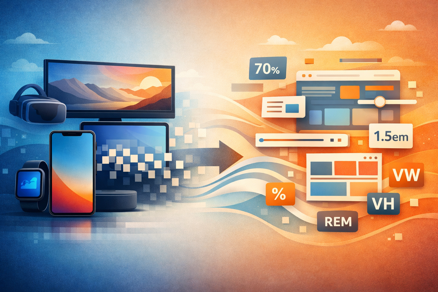
At the heart of pxless methodology is the use of relative measurement units. Instead of defining everything in pixels, designers rely on scalable units such as em, rem, percentages, and viewport-based values. These units adjust according to their surrounding context, creating a fluid design structure.
For example, when font sizes are defined using relative units, increasing the base size automatically scales headings, paragraphs, and spacing proportionally. This creates consistency without requiring manual adjustments for every element. The design becomes interconnected rather than isolated.
Proportional Layout Systems
Pxless design focuses on relationships between elements rather than fixed dimensions. Instead of assigning a container a strict width in pixels, it can be defined as a percentage of its parent element. This ensures the layout maintains balance across different screen sizes.
When proportions drive the design, elements expand and contract harmoniously. The structure remains intact even when the viewing environment changes. This principle significantly reduces layout breakage and visual inconsistencies.
How Pxless Enhances User Experience
One of the strongest advantages of pxless systems is their impact on user experience. Modern users expect seamless interaction regardless of the device they are using. A layout that works perfectly on one screen but fails on another creates frustration and weakens trust.
Pxless design adapts automatically. When users zoom in or change default font settings, the interface responds intelligently. Text remains readable. Containers expand accordingly. Spacing stays balanced. This responsiveness enhances usability and accessibility without requiring extra effort from the user.
Furthermore, pxless systems feel more natural. They align with how digital environments behave today, which is fluid rather than fixed. By embracing flexibility, designers create interfaces that feel intuitive and modern.
Pxless Typography: Building Scalable Text Systems
Typography plays a central role in any digital interface. In traditional pixel-based systems, font sizes remain static. If a user increases their browser’s default text size for readability, pixel-defined text may not scale correctly, causing overlapping or distorted layouts.
Pxless typography addresses this issue by using relative scaling. When headings, body text, and spacing are defined proportionally, adjusting the base size automatically updates the entire typographic system. This creates visual harmony and consistency.
Designers often establish a typographic scale that defines relationships between various text elements. For instance, headings might follow a structured ratio relative to body text. This structured scaling improves readability and maintains aesthetic balance across devices.
Implementing Pxless in Layout Design
Transitioning to pxless does not require abandoning structure or control. Instead, it requires thoughtful planning and a clear system. Flexible layout tools allow elements to grow, shrink, and align dynamically without fixed pixel constraints.
Spacing should also follow proportional logic. When margins and padding scale relative to typography or container size, the interface maintains consistent visual rhythm. This prevents cramped layouts on small screens and excessive whitespace on larger ones.
Another effective strategy involves defining maximum and minimum constraints. While pxless promotes flexibility, reasonable boundaries ensure elements do not scale excessively on very large displays. This balance maintains usability while preserving adaptability.
Real-World Scenario: Why Pxless Reduces Redesign Effort
Consider a growing company that initially built its platform using strict pixel values. The design looked perfect on a designer’s laptop but appeared inconsistent on larger monitors and smaller smartphones. Each new device required adjustments and patches, increasing development time and cost.
After shifting toward a pxless framework, the company restructured typography, spacing, and layout proportions. Instead of adjusting every element individually, they defined relationships between components. When screen dimensions changed, the system adapted automatically.
The result was fewer maintenance issues, improved accessibility, and a smoother user experience across devices. The shift toward pxless not only improved visual consistency but also reduced long-term operational complexity.
Challenges of Moving to a Pxless Approach
Although pxless offers significant advantages, it does come with challenges. Designers and developers accustomed to pixel precision may initially feel uncertain about relative measurements. It requires a mindset shift from fixed control to structured flexibility.
Improper scaling logic can also lead to over-expansion on extremely large screens. Without thoughtful limits, elements may become disproportionately large. This issue can be addressed by implementing constraints that maintain visual balance.
Team alignment is another important factor. For pxless systems to succeed, both design and development teams must agree on consistent scales, spacing rules, and layout principles. Clear documentation and shared guidelines ensure consistency across projects.
Pxless Beyond Web Interfaces
Although commonly discussed in the context of websites, pxless principles extend far beyond web design. Mobile applications benefit from relative scaling because devices vary in screen density and physical size. Wearable devices and interactive displays also require adaptable measurement systems.
In emerging technologies such as virtual and augmented reality, spatial relationships become even more dynamic. Fixed measurements often fail to account for user perspective and environmental context. Pxless methodologies offer a flexible foundation that adapts more naturally to these innovative platforms.
By embracing proportional logic, designers can create digital systems that evolve alongside technological advancements rather than becoming outdated quickly.
Practical Steps to Start Using Pxless
Adopting pxless does not require rebuilding everything at once. A gradual transition is often the most practical approach. Begin by defining a root text size and building your typography system using scalable units. Then convert static spacing values into relative measurements.
Testing across multiple devices is essential. Observing how elements scale in real-world scenarios allows you to refine proportions and constraints. Over time, the system becomes more predictable and easier to manage.
Two effective starting improvements include replacing fixed font sizes with relative scaling units and redefining container widths using proportional values. These changes immediately increase flexibility while maintaining structure.
The Long-Term Value of Pxless Systems
The digital world will continue evolving. New devices, resolutions, and user preferences will emerge. Rigid design systems will require constant updates to stay relevant. Pxless systems, on the other hand, adapt naturally to change.
By focusing on relationships instead of absolute numbers, you create a design framework that remains stable under shifting conditions. This stability reduces maintenance costs, enhances user satisfaction, and extends the lifespan of digital products.
Pxless is not about abandoning precision; it is about redefining precision in a scalable way. It encourages thoughtful design decisions rooted in proportional harmony rather than static measurement.
Conclusion
Pxless design represents a modern, adaptable approach to building digital interfaces. By moving away from heavy reliance on fixed pixel values and embracing relative measurements, designers create systems that scale gracefully across diverse devices and user settings.
Throughout this guide, we explored the meaning of pxless, its core principles, its advantages in accessibility and user experience, and the practical steps required for implementation. We also examined real-world benefits and potential challenges associated with transitioning to this flexible methodology.
If you want your digital projects to remain resilient, user-friendly, and future-ready, shifting toward pxless principles is a strategic decision. Start small, focus on proportional relationships, and refine your system over time. Flexibility, when structured properly, becomes one of the strongest assets in modern design.
Frequently Asked Questions (FAQs)
1. What does pxless mean in simple terms?
Pxless means designing without depending mainly on fixed pixel values. It focuses on scalable and relative measurements that adapt to different devices.
2. Is pxless suitable for all types of digital projects?
Yes, pxless principles can be applied to websites, mobile apps, and other digital interfaces where adaptability is important.
3. Does pxless eliminate the use of pixels completely?
No, pxless does not forbid pixels. It reduces reliance on them and prioritizes flexible measurement systems instead.
4. How does pxless improve accessibility?
Relative units respond better to user settings such as zoom and text scaling, making content more readable and adaptable.
5. Is it difficult to transition to pxless design?
It requires a shift in mindset and structured planning, but with proper implementation, the system becomes intuitive and manageable.